Credit @Yahoo
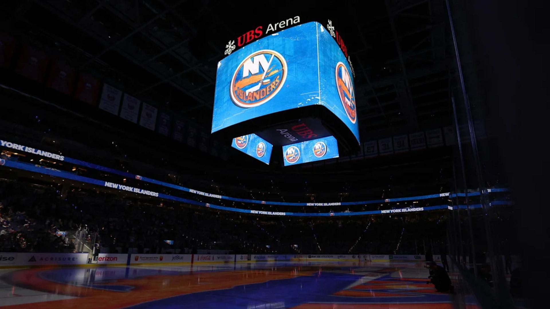
The NHL has revealed the official mark for the 2027 All-Star Weekend to give the event at UBS Arena its own identity, firmly grounded in Long Island hockey history. The mark harks back to the New York Islanders‘ 1990s “fisherman” days, with recognizable colors and local symbols woven together in a make-for-the-mid-season presentation manner.
A Design That Feels Like Home

The main color scheme is navy, teal, and orange, mimicking the unique logo of the Islanders’ controversial but iconic 30-year-old uniforms. Through the wordmark, a lighthouse emerges, representing one of the letters in “ALL-STAR” and providing a nod to Long Island’s coastal heritage.
The waves roll along the base of the logo, bringing on a puck and thus completing the link with the water from which the area is defined. The mark is completed with a variety of stars and beams of light, lending it an obvious All-Star appeal and ghosting it into its hometown.
As fans look forward to the Feb. 5-6 weekend at UBS Arena, the logo has been released. It will be featured throughout the lead up to the event on the promotion, on-ice components and merchandise to brand the skills contest and subsequent international 3 on 3 tournament.
More Than Just a Mark
For fans around the league, logos of All-Stars tend to be the first thing that sticks in their minds when they think of a host city. This one succeeds by honouring Islanders history without simply reprinting an old crest. The fisherman era colours and lighthouse give an immediate sense of place; design is clean enough to be used today.
The logo is apt for a building that’s still in the early stages of its life, and an organisation that is about to have the league’s stars bidding them welcome.The new mark will be ubiquitous at UBS Arena when the weekend comes in February. It’s already a sign that the 2027 All-Star Weekend is about to feel like it’s Long Island’s own.
About the Author